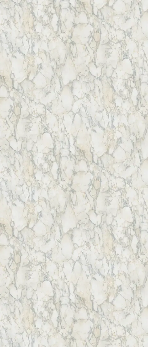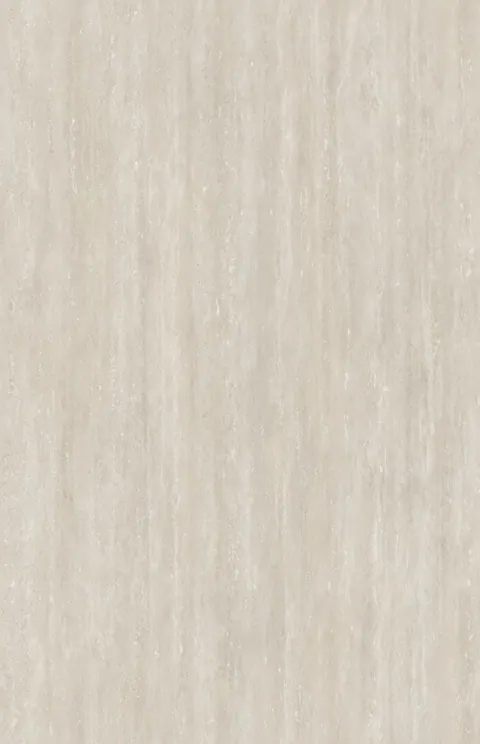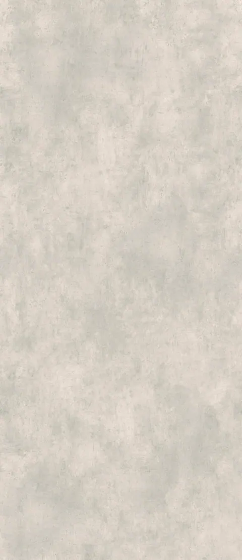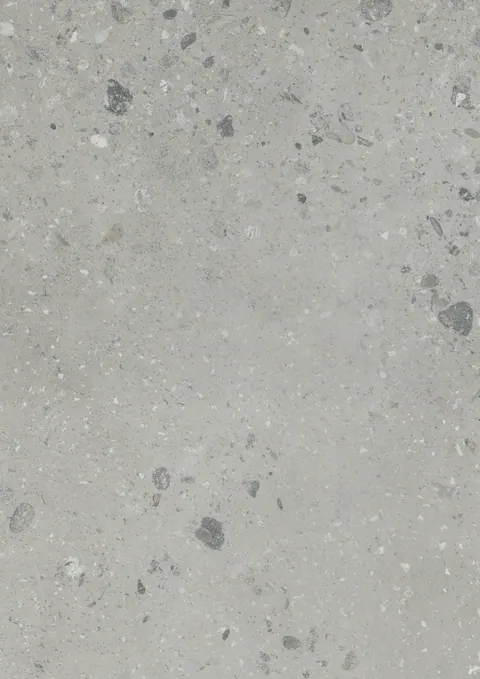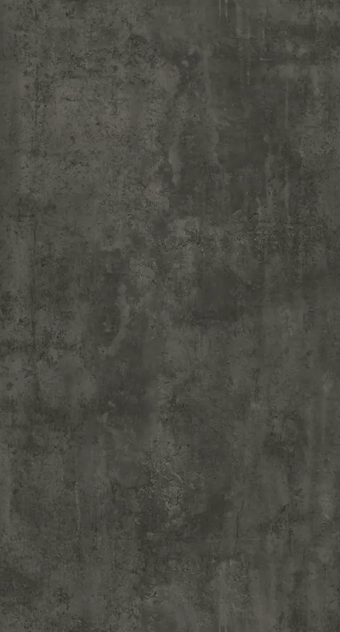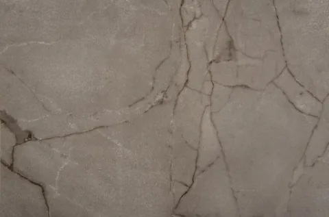
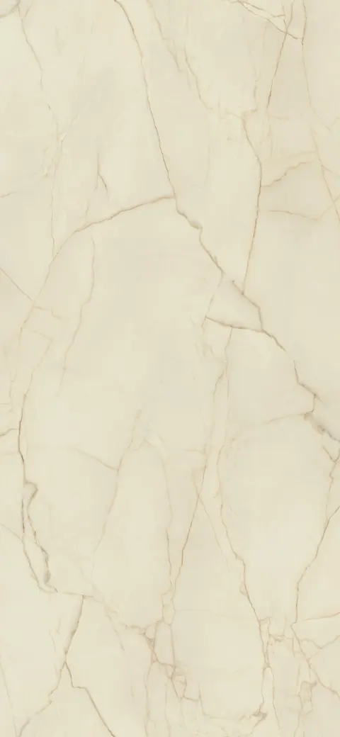



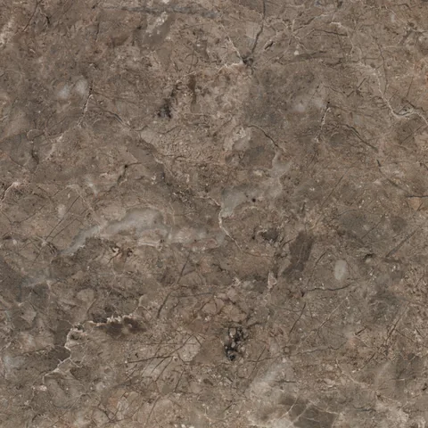


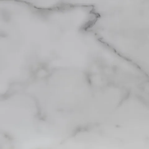
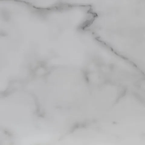






Marble Inspired
Flowing veins and soft movement for a calm, classical statement.
Finishes in this look
LHS specification guide
Worktops are specified once and lived with for years. This guide is written across every manufacturer we supply, so the advice holds whichever range you end up choosing. Explore the appearance ranges in finished kitchens, follow the buying path, compare finishes side by side — then read the detail on thickness, edges, surface finish and care, and confirm the exact specification against the manufacturer of the finish you shortlist.
Start here
Five appearance families, each shown in a finished kitchen. Tap a range to browse every finish in it at full sheet scale.
Flowing veins and soft movement for a calm, classical statement.
View collection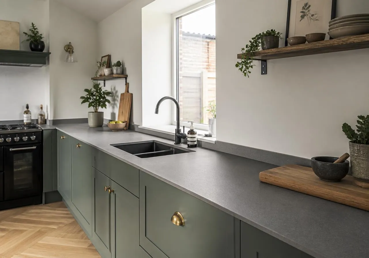
Quarried textures, slate greys and weathered mineral surfaces.
View collection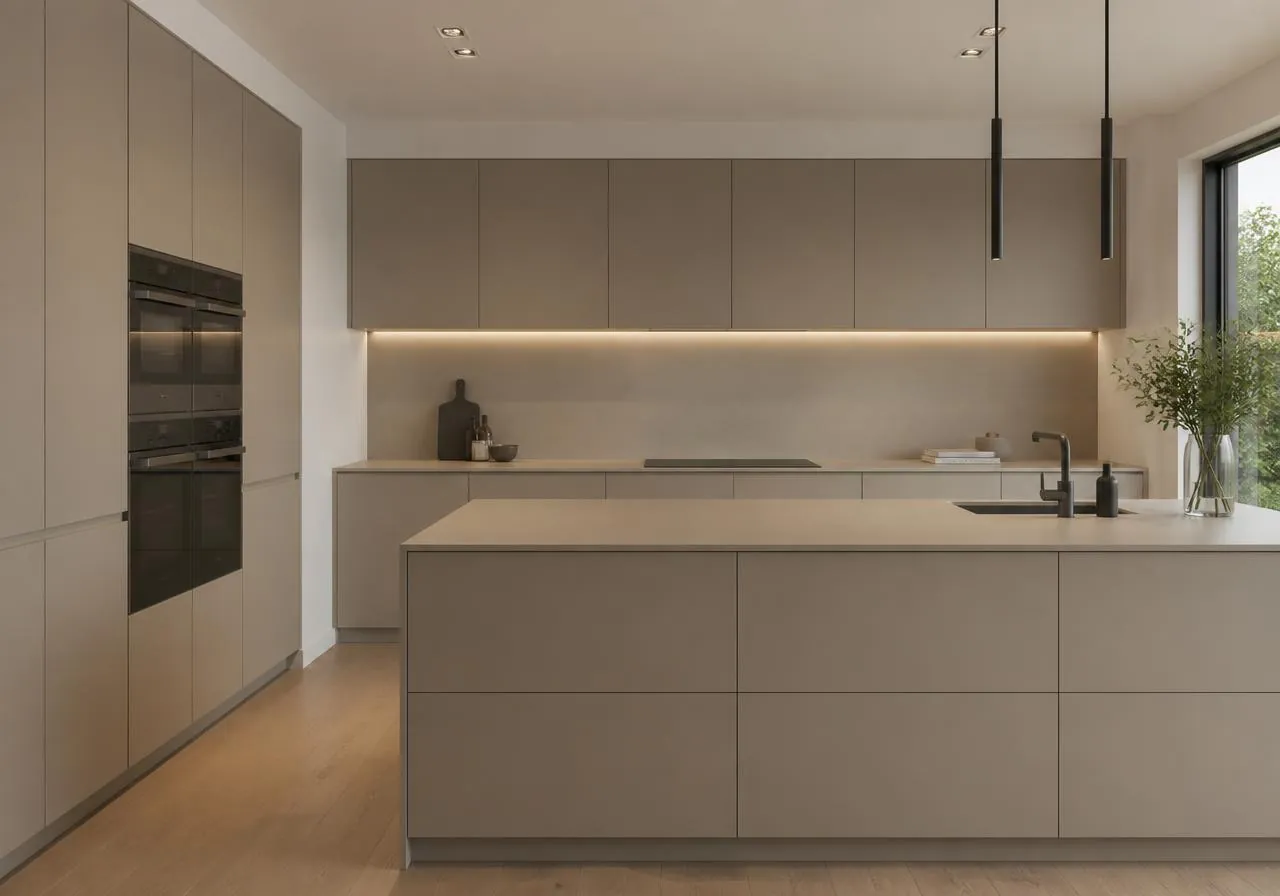
Quiet solids and subtle shimmer for pared-back interiors.
View collection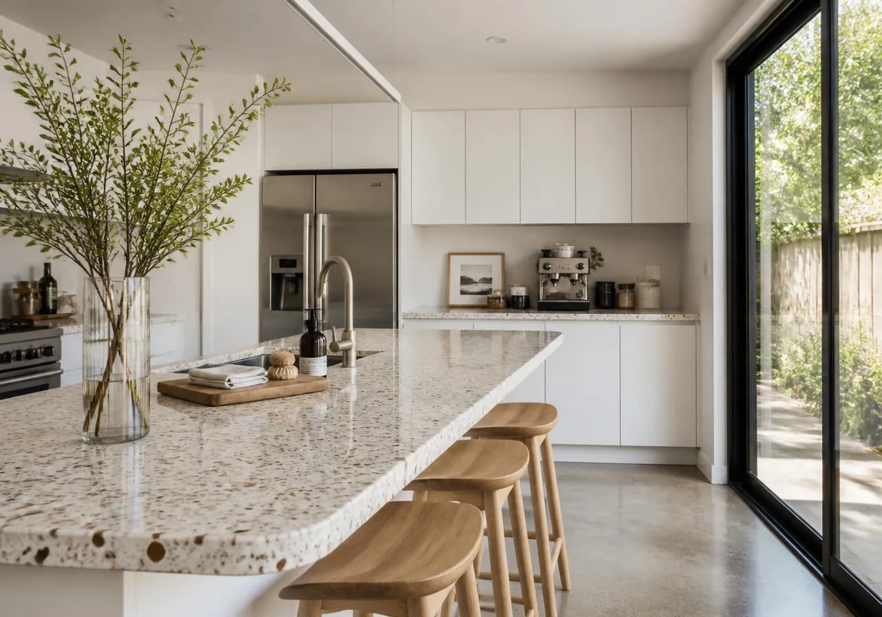
Speckled aggregates and crafted patterning with real character.
View collection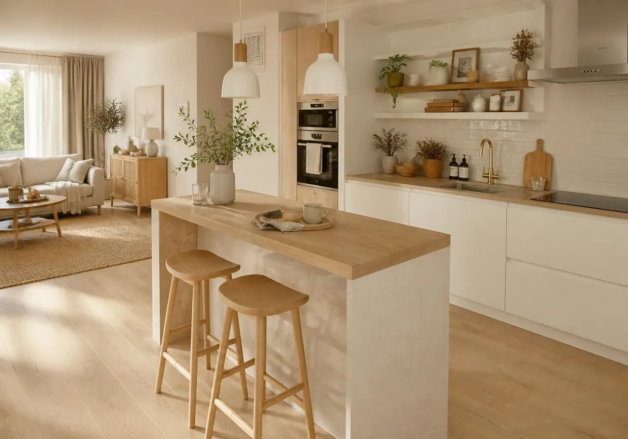
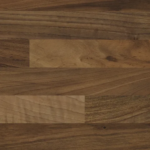
Grained warmth, from pale oak to deep, smoked walnut.
View collectionA worktop is the largest continuous surface in most Irish kitchens and the one that takes the hardest use. Before comparing colours, work through six practical decisions with your kitchen designer or fitter — they narrow the collection far faster than browsing on appearance alone.
The short path
Traditional or shaker kitchen?
Design direction
Warm Classic
Worktop character
Gentle veining, warm undertone
Profile
38mm, bullnose or square edge
Recommended range
Marble Inspired
Handleless or minimal kitchen?
Design direction
Quiet Contemporary
Worktop character
Low movement, matt surface
Profile
Slim 12–22mm, square or mitred
Recommended range
Contemporary Finishes
Busy family kitchen?
Design direction
Urban Industrial or Warm Classic
Worktop character
Mid to dark, textured, forgiving
Profile
Any — prioritise a matt surface
Recommended range
Stone Inspired
Want natural warmth?
Design direction
Natural Organic
Worktop character
Grain, knots and tonal depth
Profile
Plan grain along the run length
Recommended range
Wood Effect
Measure the longest uninterrupted run first. Long runs, islands and peninsulas show pattern repeat and joint positions more than short galley runs, so a quieter finish usually reads better. Note every corner, return and appliance cut-out — these dictate where joints fall and how a pattern travels.
A family kitchen that doubles as a homework table and baking bench wants a mid-tone, textured or patterned surface that disguises crumbs, water marks and light scratching. A second kitchen or utility used lightly can carry a paler, higher-contrast finish.
North-facing Irish kitchens receive cool, flat daylight for much of the year. Warm neutrals, oak-toned wood effects and cream-veined marble looks lift those rooms; cold greys can read grey-blue and lifeless. South-facing and roof-lit rooms can carry cooler, crisper whites.
Work from tone contrast rather than matching colours. Strongly grained or dark doors pair with a lighter, low-movement worktop; quiet matt doors can carry a worktop with real pattern. Handleless slab kitchens usually want minimal worktop movement so the horizontal line stays clean.
Every surface needs care, but they differ in how forgiving they are. Matt mid-tones and grained wood effects hide day-to-day marking best. High-gloss and very dark plain surfaces look spectacular on day one and show dust, fingerprints and swirl marks soonest.
Set a realistic per-metre allowance including edge treatment, upstands or splashbacks, cut-outs and fitting before shortlisting. Being clear about the tier lets our trade team steer you towards finishes that will still be available and priced sensibly when you order.
Quick tool
Select everything that matters in your kitchen and we’ll point you at the design style, appearance range and finishes that fit.
Choose one or more priorities on the left and your recommendation will appear here.
The collection is grouped by how a finish looks rather than by what it is made from. That lets you compare like with like across product ranges and avoids implying a material composition a particular sheet may not have. Our team confirms substrate, thickness and performance for anything you shortlist.
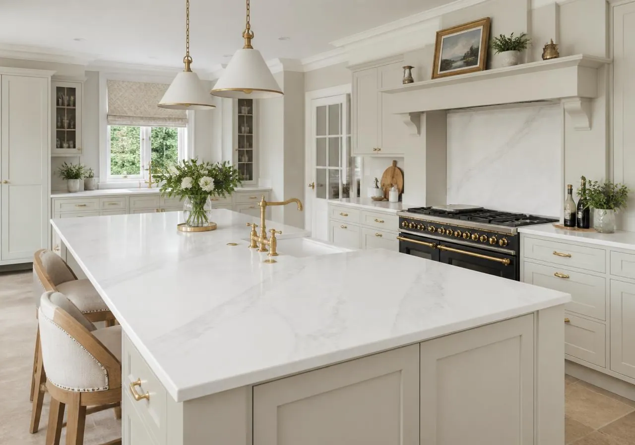
Flowing veins, soft tonal drift and a bright, luminous surface, taking their cue from Calacatta, Carrara and Statuario. Best where the worktop should feel calm and classical: pale or painted cabinetry, brass or matt black ironmongery, plenty of daylight. Vein density varies between sheets, so choose a quieter vein for long runs and a bolder one where the worktop turns up into a splashback.
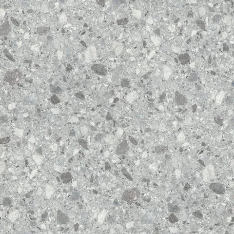
Slate greys, honed limestone looks, granite speckle and concrete-like matt textures. Where marble reads bright and flowing, stone inspired finishes read grounded and even. They are the most dependable choice for hard-working family kitchens and utility rooms because mid to dark tones disguise everyday marking well.
Finishes in this range
Grain, knots and tonal warmth from pale limed oak through natural planked boards to smoked walnut, on a surface built for kitchen use — with none of the oiling and sanding a solid timber top needs. A natural fit for Scandinavian, organic and warm classic kitchens, breakfast bars and freestanding furniture. Plan runs so the grain travels along the length and matches at joints.
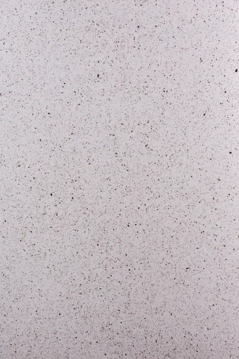
Speckled aggregate chips, crafted repeats and mixed-tone surfaces with real personality. These work best as a deliberate design decision — an island, a utility run, a coffee station — where the surface is meant to be noticed. Pair them with plain, low-contrast doors so the result stays composed rather than busy.
Finishes in this range
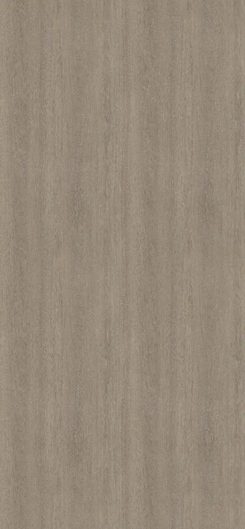
Quiet solids, soft neutrals and surfaces with subtle shimmer or fine grain rather than obvious pattern. The natural partner to handleless kitchens, integrated appliances and open-plan spaces where the worktop should recede. With little pattern repeat they are also the most forgiving across long runs, breakfast bars and mitred returns.
Finishes in this range
Compare the ranges
Design direction
Four directions cover most of the kitchens we supply in Ireland. Look first, read second — pick the room that feels like yours.
Handleless doors and long, even runs — the worktop recedes.
Painted shaker cabinetry softened by gentle, warm veining.
Dark cabinetry, black metal and weighty concrete texture.
Timber, clay tones and tactile grain you want to touch.
Inspiration
The same worktop reads very differently depending on the cabinetry around it. These four rooms show each appearance range installed and in use.
Marble Inspired
Finishes in this look
Stone Inspired
Finishes in this look
Wood Effect
Finishes in this look
Contemporary Finishes
Finishes in this look
Two kitchens can use the same colour and look completely different because of edge detail alone. Thickness and profile set whether a kitchen reads traditional, transitional or contemporary, and they affect cost as much as the finish itself.
Most postformed and square-edge worktops are supplied around 38mm, which suits shaker and traditional kitchens and gives a substantial, familiar profile. Slimline surfaces of roughly 12–22mm read far more contemporary and sit well under handleless doors and integrated appliances. Compact laminate is thinner again, typically 12mm, for the sharpest possible edge line.
A postformed bullnose is the softest and most traditional. A square or pencil-round edge is the current default for transitional kitchens. A mitred or wrapped edge builds a thicker apparent depth on a slim core and gives a waterfall detail on island ends. Bevelled and chamfered edges sit between the two.
Plan joints away from sinks, hobs and the front edge of an island wherever possible, because that is where water and heat concentrate and where the eye lands first. Mason's mitres give a cleaner corner than a butt joint on patterned and wood effect surfaces, since the pattern can be aligned across the corner.
Undermount sinks, flush hobs and boiling water taps all impose their own cut-out and clearance requirements, and not every surface supports every method. Confirm the sink and tap specification before the worktop is ordered rather than after — retrofitting a cut-out method is the most common cause of delay we see.
Surface finish changes how a colour behaves under real kitchen lighting more than most people expect. The same colour in matt and in gloss can look like two different products once installed under downlights.
Worktop surfaces in this collection are designed for daily kitchen use, but a few habits keep them looking new for far longer. These apply across appearance ranges unless the manufacturer's care sheet says otherwise.
A worktop rarely works alone. Coordinating upstands, splashbacks and end panels are what make a kitchen run read as one continuous surface rather than a collection of parts.
A slim upstand of roughly 100mm in the worktop finish covers the wall junction, removes a difficult silicone line and is the most cost-effective way to tie the run together. It suits kitchens with tiling or paint above.
Running the worktop finish up the full wall behind a hob or sink turns the surface into a feature and removes grout lines entirely. It is the strongest way to showcase a marble inspired or terrazzo finish, and it is far easier to wipe down than tile.
Carrying the finish down the exposed end of an island or a run of tall units creates the waterfall detail seen in contemporary kitchens. Pattern alignment at the mitre matters here, so flag it at specification stage.
Because coordinating components are produced range by range and batch to batch, confirm the full component list with our team at the same time as the worktop so everything is drawn from matched stock wherever possible.
The finishes that photograph best are not always the ones that live best. If your kitchen is the busiest room in the house, weight your decision towards forgiveness.
Four directions cover the majority of the kitchens we supply. Each has appearance ranges that consistently hold up, and each is explored in full — with photography and matching colours — in the Design Styles guide.
Painted shaker doors in sage, off-white, navy or clay want a worktop with gentle warmth and some movement. Cream-veined marble inspired finishes and warm stone inspired surfaces both work; a 38mm profile keeps the proportions traditional. Avoid cold, blue-toned greys, which fight painted timber.
Slab doors, integrated appliances and long horizontal lines call for a quiet contemporary finish or a low-movement stone inspired surface, ideally in a slim profile with a square or mitred edge. Let the cabinetry and lighting carry the design and keep the worktop even.
Concrete-like matt textures, dark slate tones and graphite surfaces alongside black metal, open shelving and dark ironmongery. A mid to dark stone inspired finish grounds the scheme and copes well with heavy use.
Timber-toned wood effect surfaces, soft travertine and limestone looks, and warm neutral contemporary finishes, paired with oak or limed doors and unlacquered brass. Texture matters more than colour here.
Almost every problem we are asked to solve after installation traces back to one of these five decisions. All of them are easy to avoid at specification stage and expensive to correct afterwards.
A 100mm swatch cannot show pattern scale or vein direction. Always judge a finish at full sheet scale and view a physical sample in the room's own light before committing.
Joint positions are set by sheet length and kitchen layout, not by preference. Ask for a worktop drawing showing joints before ordering, particularly on patterned and wood effect finishes.
Undermount sinks, flush-fit hobs and boiling water taps all impose cut-out and clearance requirements. Fix that specification first — the Kitchen Sinks & Taps guide covers the decisions involved.
These are frequently left out of the initial budget and then added late, when matched batch stock may no longer be available. Price the complete component list from the outset.
Gloss is beautiful in a showroom and demanding in a family kitchen. If you love the look, keep it to a low-traffic run rather than the main prep area and island.
Moodboards
Three schemes we are asked for most often, each with the worktop appearance range and the specific finishes that carry it.
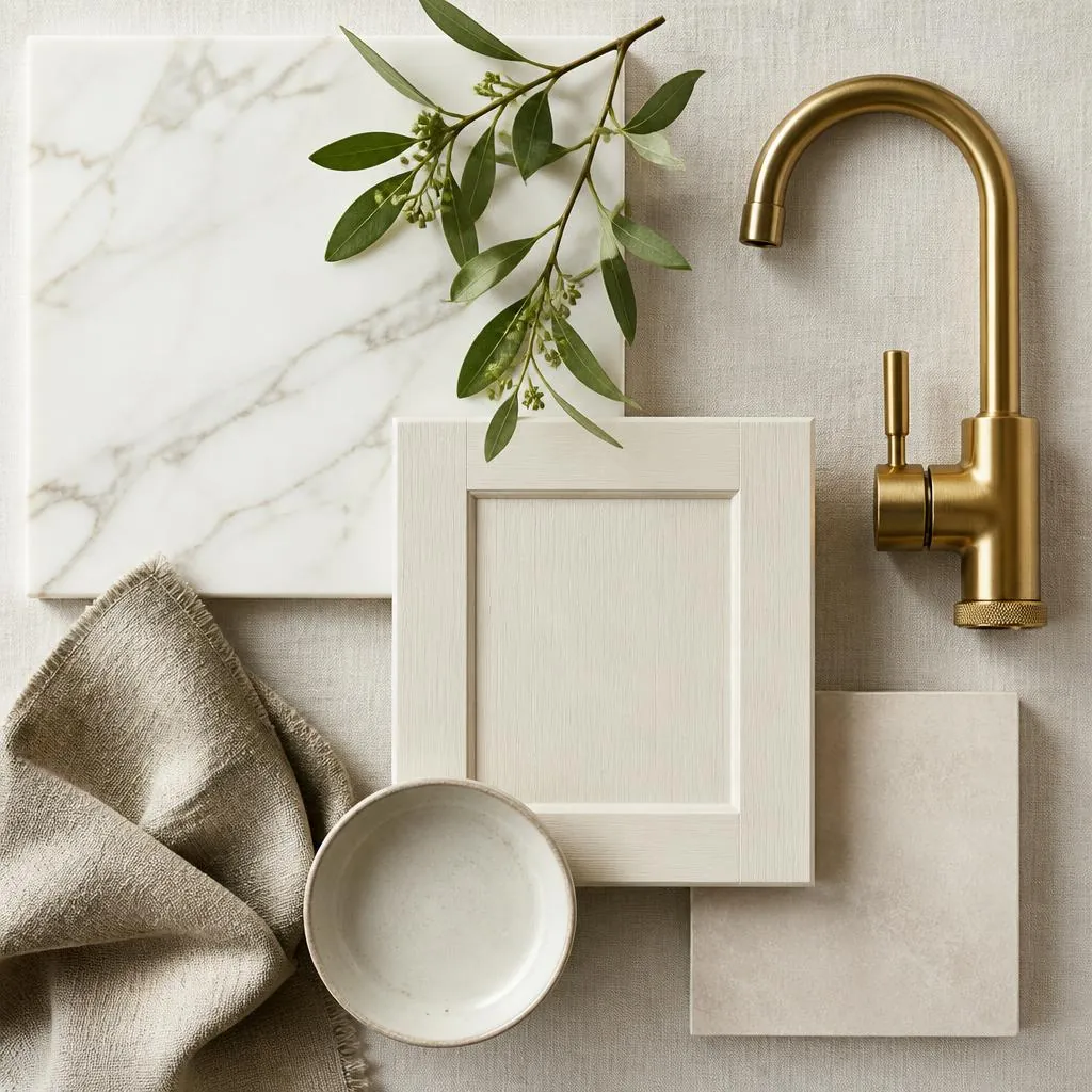
Marble Inspired
Off-white cabinetry, unlacquered brass and a bright, softly veined worktop. The most requested look in Irish coastal and new-build kitchens, and the easiest to live with in low winter light.
Suggested finishes
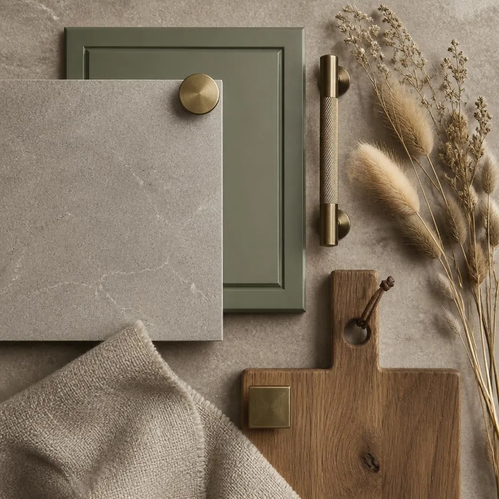
Stone Inspired
Sage or clay painted shaker doors, aged brass and a warm mineral worktop with even texture. A hard-wearing scheme that suits farmhouse and family kitchens without feeling heavy.
Suggested finishes
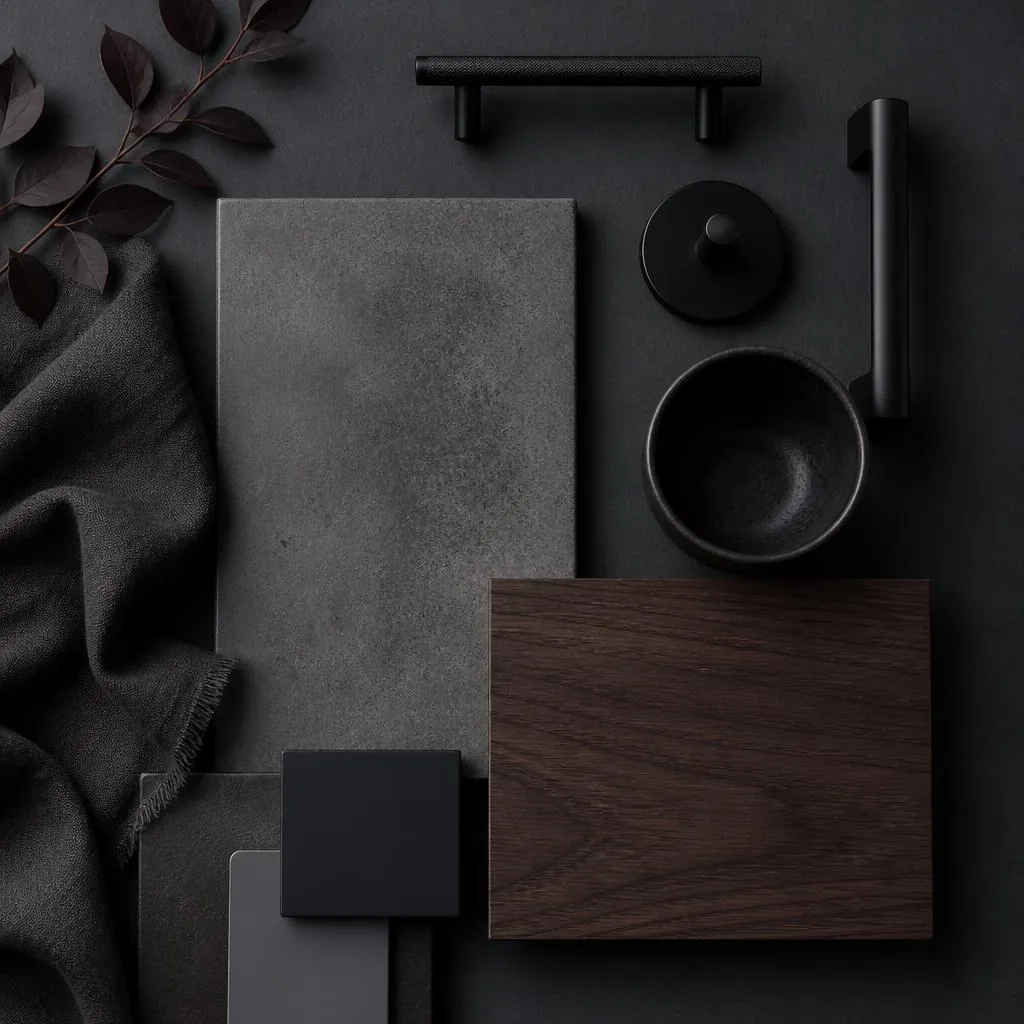
Contemporary & Stone Inspired
Graphite and concrete tones, matt black ironmongery and smoked timber accents. Designed for apartments and open-plan extensions where the kitchen reads as furniture rather than units.
Suggested finishes
Specification questions
Practical answers grouped by topic — choosing a style, cleaning and maintenance, thickness and edges, colours and finishes, and how to order.
Start from tone rather than colour. Pair a light, low-movement worktop with strongly grained or dark doors, and use a worktop with more pattern when the doors are quiet and matt. The Design Styles guide groups finishes into four directions — Quiet Contemporary, Warm Classic, Urban Industrial and Natural Organic — with the worktop colours that sit naturally in each.
Stone inspired finishes are usually our first recommendation for hard-working kitchens. Their mid to dark tones, matt surfaces and fine speckle disguise crumbs, water marks and light scratching better than any other range, and they sit comfortably beside painted shaker doors, timber and handleless slab fronts alike.
Painted shaker doors want warmth and a little movement. Cream-veined marble inspired finishes and warm stone inspired surfaces both work well, usually in a 38mm profile with a bullnose or square edge to keep the proportions traditional. Cold blue-toned greys tend to fight painted timber, particularly in north-facing Irish kitchens.
Choose a quiet contemporary finish or a low-movement stone inspired surface in a slim profile with a square or mitred edge. With slab doors and integrated appliances the design relies on long uninterrupted horizontal lines, so the worktop should stay even and let cabinetry and lighting do the talking.
Wipe spills promptly with a soft cloth, warm water and mild detergent, then dry the surface — standing water around joints and the sink run is the main cause of long-term damage. Always use trivets for hot pans and a chopping board for cutting, and avoid abrasive creams, scouring pads, bleach and strong solvents, which permanently dull matt finishes. Test any new cleaner on an offcut first.
Yes — and considerably more practical than natural marble, which is porous and etches on contact with lemon, wine and vinegar. A marble inspired worktop gives you the veining and brightness with a sealed, non-porous working surface. Because pale surfaces show crumbs and coffee rings more readily than mid-tones, choose a finish with some vein movement if the kitchen is busy, and keep joints away from the sink.
No. A wood effect worktop gives you grain, knots and tonal warmth without the sanding, oiling and water-sensitivity a solid timber top demands — normal wiping is all it needs. The one thing to plan carefully is grain direction: set runs out so the grain travels along the length of the worktop and aligns at joints and mitred corners.
Mid-tone, matt or textured surfaces with some pattern — stone inspired speckle, terrazzo aggregate and wood grain in particular. They hide fingerprints, dust and light scratching best. The highest-maintenance combination is a very dark, plain, high-gloss surface, which looks superb but shows every mark.
Available sheet sizes, thicknesses, edge profiles and matching upstands or splashbacks vary by range and finish. Contact the trade team with the finishes you are considering and we will confirm current availability, lead times and any minimum order requirements.
Most finishes in the collection can be supplied with coordinating upstands, splashbacks and panels so a run reads as one continuous surface. Because matching components are produced range by range, confirm with our team early in the specification so everything is drawn from the same batch wherever possible.
Compact laminate is a solid, through-coloured panel with no separate core, typically around 12mm thick. Because it needs no edge banding it gives the slimmest, sharpest edge line available, which suits handleless contemporary kitchens, and it is highly water resistant, making it popular for utility rooms and island runs. It sits at a higher specification tier than standard postformed worktops, so price it early if the slim profile is important to you.
Around 38mm is the traditional standard and suits shaker and classic kitchens. Slimline surfaces of roughly 12–22mm read distinctly contemporary and pair well with handleless doors and integrated appliances. A mitred or wrapped edge lets you build a thicker apparent depth on a slim core, which is how the chunky island profiles in contemporary kitchens are usually achieved.
A postformed bullnose is the softest and most traditional; a square or pencil-round edge is the transitional default; a mitred or wrapped edge gives a contemporary waterfall detail on island ends. The profile changes the character of a kitchen as much as the colour does, and it affects cost, so decide it alongside the finish rather than afterwards.
Most finishes can be supplied with coordinating upstands, full-height splashbacks and end panels. A full-height splashback behind the hob or sink removes grout lines entirely, wipes down far more easily than tile and is the strongest way to show off a marble inspired or terrazzo finish. Confirm the complete component list with our team at the same time as the worktop so everything comes from matched batch stock.
Every finish is photographed as a full sheet so you can judge scale, movement and pattern repeat rather than a small crop. Screen calibration, ambient light and batch variation still change how a surface reads in a real kitchen, so we always recommend viewing a physical sample before you commit to a finish. Our team can arrange samples for any colour in the collection.
The categories describe how a surface looks, not what it is made from. Grouping finishes by appearance — marble inspired, stone inspired, contemporary, terrazzo and patterned, or wood effect — lets you compare like with like across different product ranges, and avoids implying a material composition that a particular sheet may not have. Our team will confirm the exact substrate, thickness and performance characteristics for any finish you shortlist.
Surfaces in this collection are supplied as manufactured worktop sheets rather than quarried slabs, which is why the ranges are described by appearance — marble inspired, stone inspired, wood effect and so on — rather than by material claim. Depending on the range, that can mean a laminate-faced core, a compact laminate panel or a solid surface product, each with different thicknesses, edge options and performance. Tell our trade team which finishes you like and they will confirm exactly what each one is and how it performs.
Note the finish names you are interested in and send them to the Light Hardware Supplies trade team using the enquiry form on the main website. Include the approximate linear metres, any island or breakfast bar, and your preferred edge detail, and we will come back with pricing, availability and specification guidance.
Send us the finishes you are considering along with your approximate run lengths and we will come back with pricing, availability, sample options and specification guidance.
Explore more from LHS